How to Improve First-Time User Experience for Your WordPress Products
Making a good first impression matters; you won’t get another shot.
Let’s get to the point right away. Your users want to experience an impressive product tour when they first start using it. But, they wouldn’t allow you much time to grab their attention and guide them to explore the features.
That’s why it’s important to ensure a pleasant first-time user experience (FTUE). It’s that initial interaction that can either captivate or frustrate a user.
In this article, we’ll delve into what FTUE is, and how it influences the UX of WordPress plugins and themes. Most importantly, we’ll guide you through the process of planning an excellent FTUE for your next products.
Definition of first-time user experience (FTUE)

The term first-time user experience (FTUE) pretty much tells everything what it means. FTUE refers to the user’s first encounter with a product, service, or software. It’s that initial handshake, the welcoming embrace, and the first moments of interaction that set the stage for the user’s journey.
In the context of WordPress, when users first activate your plugins and themes, they begin their journey with your product. This initial experience involves the onboarding process and guides the users in exploring and using the various features your product offers.
Importance of a positive FTUE
Imagine walking into a store, and instead of a friendly greeting, you’re met with confusion and chaos. Would you want to return to that store? Likely not. Similarly, if a user’s first experience with your product is unpleasant, chances are they won’t return.
88% of consumers are less likely to return after a bad experience.
Toptal
That’s why a positive FTUE is the foundation of user satisfaction and retention. It leads to users not only staying but also recommending your product to others. It’s your chance to make users feel at home, reducing the likelihood of them seeking alternatives.
How FTUE may impact the UX of WordPress plugins & themes

WordPress, with its vast ecosystem of plugins and themes, is an excellent example of where FTUE can significantly impact user experience. If a user downloads a plugin or theme and struggles to configure it or understand its features, frustration sets in. They may even abandon the product and never use it again.
94% of initial impressions can be attributed to design-related issues – According to CXL.
On the flip side, a well-designed FTUE for a WordPress plugin or theme can lead to user delight. Users should feel confident and excited about exploring the product’s capabilities. It can result in positive reviews, recommendations, and a loyal user base.
The First-Time User Experience (FTUE) plays a crucial role in shaping the overall User Experience (UX) of WordPress plugins and themes. Here’s how FTUE impacts the UX of WordPress plugins and themes:
1. Initial user engagement
If users find the plugin or theme easy to set up and use from the start, they are more likely to engage with its features fully. They explore functionalities, customize settings, and utilize the product to its fullest potential.
2. User satisfaction and retention
A smooth onboarding process and clear instructions build user confidence. Users are more likely to continue using the plugin or theme, leading to higher retention rates. Besides, when users can achieve their goals easily during their first interaction, they are satisfied.
If users encounter difficulties during the setup, they might uninstall the plugin or switch to a different theme immediately. Frustration during the initial experience results in dissatisfaction and negative reviews. This impacts the plugin or theme’s reputation.
3. Learning curve
An intuitive FTUE reduces the learning curve. A complex or unclear FTUE increases the learning curve. Users might struggle to understand how to use the product, leading to frustration and a slower adoption rate.
4. Customer support requests

A confusing FTUE results in a higher volume of customer support requests. Users seek assistance for basic tasks, increasing the workload for customer support teams.
5. Community engagement
Happy users are more likely to engage in community forums, discussions, and social media groups. They share their positive experiences, attracting more users to the plugin or theme. However, dissatisfied users engage in negative discussions and discourage potential users and developers from using the product.
6. Upgrade and premium feature adoption
Users pleased with the free version’s FTUE are more inclined to upgrade to premium versions. They trust the developer’s ability to deliver a seamless experience. Similarly, users disappointed with the FTUE of the free version are unlikely to invest in premium features. A subpar initial experience discourages users from making financial commitments.
7. User-generated content
Satisfied users create tutorials, videos, and blog posts praising the plugin or theme. Positive user-generated content boosts the product’s visibility and attracts a wider audience. Unhappy users might create negative reviews, videos, or articles detailing their frustrating experiences. And, negative user-generated content can deter potential users from trying the product.
How to plan a first-time user experience for your WordPress products?
Remember, the first-time user experience sets the tone for your relationship with customers. So, you need to invest time and effort into creating a welcoming and intuitive environment. Follow the below points to pave the way for long-lasting customer relationships and positive word-of-mouth referrals.
1. Understand your target audience
Imagine you’re throwing a party – you wouldn’t invite heavy metal fans to a jazz night, right? Understanding your audience is like knowing your party crowd. Dive deep into their likes, dislikes, and aspirations. So, get to know your audience; it’s the first step towards building a product they’ll fall in love with. We can classify WordPress users into the three following fraternities:
- Beginners:
Beginners in WordPress are individuals who have recently ventured into the platform and exploring its fundamental features and functionalities.
- Experts
WordPress experts are seasoned professionals with in-depth knowledge and experience in various aspects of the platform.
- Service providers
WordPress service providers encompass a diverse group of freelancers, agencies, consultants, and specialists who offer professional services within the WordPress ecosystem.
2. Identify the use cases of your products
Determining the use cases of your product is like finding the right key for a specific lock. Take smartphones, for instance. They started as communication devices, and now? They’re our personal assistants, fitness coaches, and entertainment hubs! So, brainstorm those use cases for your product.
3. Design a user-oriented onboarding process
People are more likely to continue using a product if the onboarding experience is smooth. , the majority of them ditch a product that fails to impress them in the first place.
74% of potential customers will switch to another solution if the onboarding process is complicated
The Good
So, designing a user-oriented onboarding process is like being a guide to your users. So, make it seamless, make it exciting. It’s not just an introduction; it’s the opening chapter of a thrilling adventure! Here’s an example of a clean FTUE:
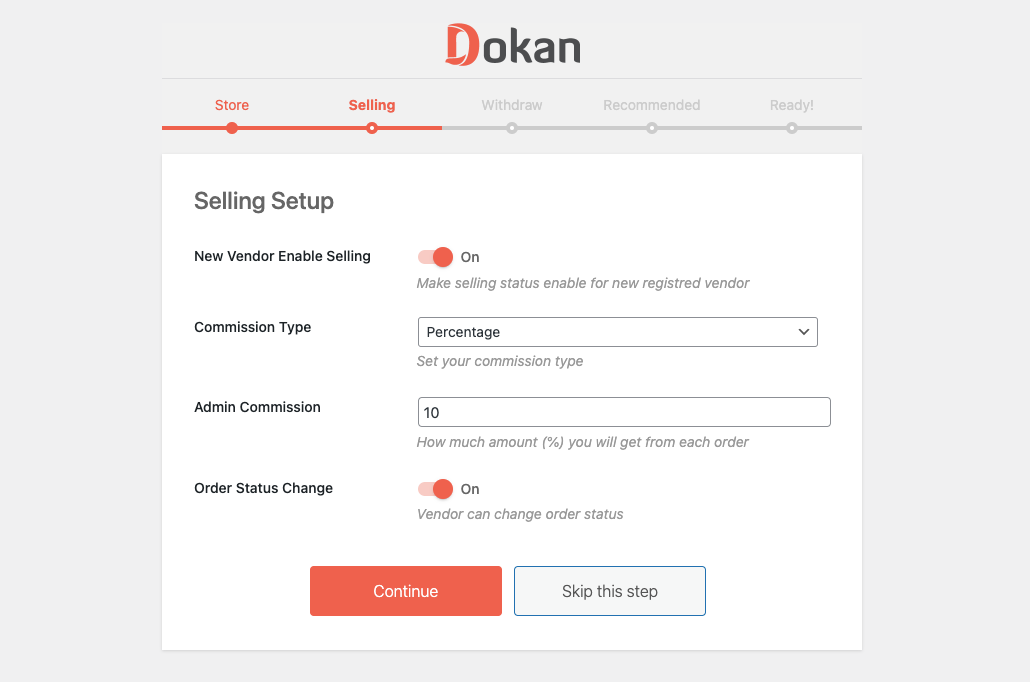
Dokan multivendor guides its users with a self-explanatory setup wizard. It provides additional information where needed. And, a progress bar shows the finished steps and the remaining steps to be completed. Even, users can skip a certain step if they prefer.
4. Keep the user interface (UI) clean
Studies show that users form an opinion about a website within 0.05 seconds of their visit. That might vary for your software, but the difference won’t be significant. So, make those seconds count. Clean UI is not just visually appealing; it’s a reflection of your brand’s professionalism and user-centric approach.
5. Think about accessibility considerations
Accessibility ensures that individuals with disabilities can perceive, understand, navigate, and interact with your products. It involves designing and developing websites, tools, and technologies so that people with disabilities, including visual, auditory, physical, speech, cognitive, and neurological impairments, can access and use them effectively.
An estimated 1.3 billion people experience significant disability. This represents 16% of the world’s population, or 1 in 6 of us.
World Health Organization
That’s a massive audience you don’t want to miss! So, accessibility considerations are not just legal requirements; they’re a moral obligation. It’s not just compliance; it’s about creating a digital world where everyone can participate, engage, and enjoy.
6. Implement tooltips to guide users
Think of tooltips as friendly whispers, guiding users through your software like a personal tour guide in unfamiliar territory. They transform confusion into clarity, hesitation into confidence, and complexity into simplicity.
Now, picture this: your user is hovering over a complex setting. With a tooltip, they instantly understand what it does and why it matters. They feel confident, informed, and in control – all crucial elements for a positive FTUE.
7. Collect feedback with micro surveys
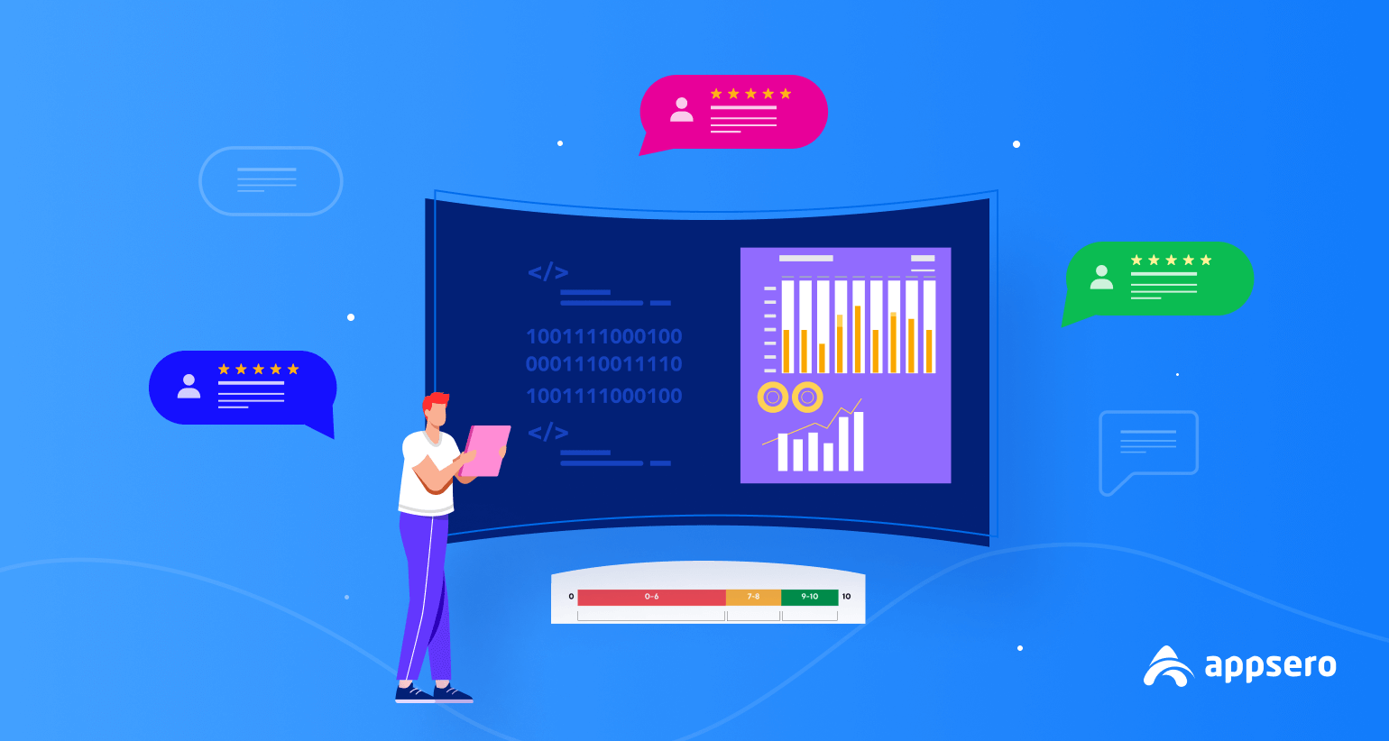
Instead of bombarding your users with lengthy surveys, you can ask quick, targeted questions. It’s like a friendly chat, not an interrogation. Micro surveys have a much higher response rate than traditional surveys. Why? Because they respect your users’ time while providing you with valuable feedback.
For example, you can ask users, “What’s one thing you wish this plugin could do?” It’s not just a question; it’s an invitation to co-create. Users don’t just feel like consumers; they feel like collaborators in your product’s journey. Thus, micro surveys not just collect feedback; they help in building relationships, understanding emotions, and shaping a product that resonates deeply with your audience.
8. Use conversational copies
Copies are not just words; they’re the bridge between your product and your users’ hearts. They should feel an instant connection with your product after reading the copies. Conversational copies not only explain features; they invite users into a story where readers are the heroes. So, you need to use compelling copies to nudge users to explore and invest in the journey you’ve crafted for them.
9. Consider implementing best FTUE practices for WordPress products
You need to create WordPress themes and plugins that allow users, regardless of their skill levels, to comfortably navigate and utilize their features. User-friendly design, clear onboarding processes, and accessible support are the few things that can significantly enhance the FTUE. You can consider addressing the following common FTUE issues:
a. Convey a warm and helpful welcome message
This is the first point of contact with your users. So, your message should be genuine, friendly, and personalized. Express genuine gratitude for their presence, acknowledging how important they are to your community or platform. It’s better to use a warm tone and simple language, avoiding jargon or complex phrases.
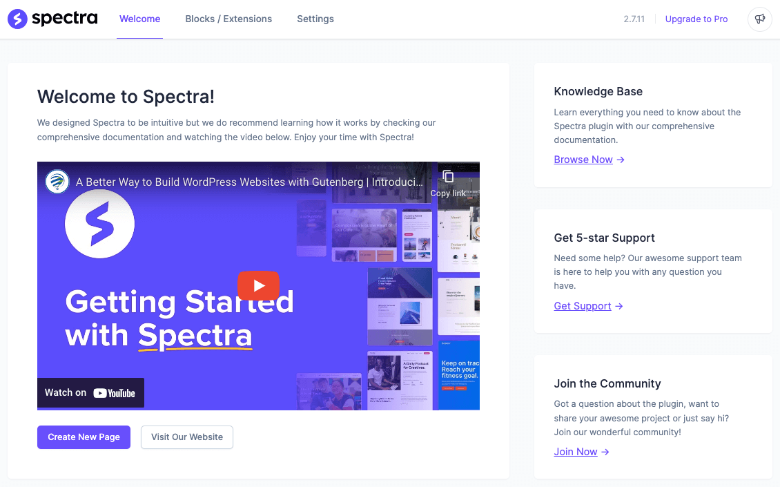
You can get inspiration from Spectra in this case. They also provide a knowledge base, support portal, and access to the community to guide new users.
To welcome them warmly, you can say, “We’re thrilled to have you here! If you have any questions, don’t hesitate to ask. You’re now part of our wonderful community, and we’re here to make your experience amazing.” Remember, the key is to be authentic and create a sense of belonging. making users feel like they’ve found a supportive and friendly environment from the very beginning.
b. Redirect them to the settings page
Redirecting users directly to the settings page can be a practical approach, especially if your product aims for simplicity. You can streamline the onboarding process by guiding users to the settings page immediately. However, it’s crucial to ensure the settings interface is intuitive and not overwhelming for users who might be new to the platform.
c. Allow expert users to make a choice
You can adopt this method if your user base is already familiar with WordPress. Providing them with choices empowers them and allows for a more personalized FTUE. Instead of redirecting them forcefully, you can present them with options. For instance, offer buttons like “Set Up Now” and “Explore First.” This approach respects users’ autonomy, allowing them to decide the pace of their onboarding journey.
d. Provide a clear call-to-action (CTA)
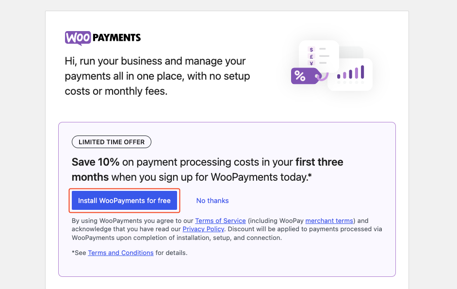
Start by using compelling language that clearly communicates the benefit of taking the action. Place the CTA prominently so that it stands out visually from other elements. You should use contrasting colors, whitespace, and bold fonts to draw attention. Ensure the CTA is clickable and mobile-friendly. This way you can create CTAs that are both enticing and effective and drive user engagement and conversions.
e. Try to WOW users with a setup wizard
Setup wizards can guide users through the essential steps, offering explanations, tooltips, and interactive elements. You can introduce users to key functionalities, making the onboarding process both informative and enjoyable. Here are a few suggestions on how you can pull off a WOW moment successfully:
- Gamification: Introduce gamified elements like badges, rewards, or progress bars, encouraging users to complete tasks and explore features with enthusiasm.
- Stunning visuals: Use high-quality graphics, animations, and visually appealing UI elements to create an aesthetically pleasing onboarding interface.
- Creative storytelling: Frame the onboarding process as a story and guide users through the product’s features in a narrative format to make it more engaging and memorable.
- Quick wins: Include easy tasks that provide instant gratification, demonstrating the immediate benefits of your product and motivating users to explore further.
- Positive feedback: Provide positive reinforcement for completed actions, such as encouraging messages or visual cues.
And remember that, more than 80% of users tend to bypass product tours that involve more than 5 steps. So, don’t overdo the designs to impress users.
10. A/B test different onboarding flows and improve
Ever wondered what sets apart a good First-Time User Experience (FTUE) from a regular one? It’s not just guesswork; it’s A/B testing. Instead of relying on gut feelings, A/B testing gives you concrete answers. That’s why you need to experiment, iterate, and shape your product’s FTUE for betterment.
Track your WordPress plugin data with Appsero

If your niche is based on WordPress, you can utilize Appsero’s analytics functionalities to gather user data. These data will help you ensure a better first-time user experience and improve your product. Additionally, Appsero provides powerful reporting tools that make it easy to visualize and understand the data.
You’ll get the following data by using Appsero while managing your WordPress products.
- Total activations and deactivations
- Most used plugins with your product
- Most deactivation from themes
- Deactivation reasons
- All sales & revenue data
Once you get this data analysis from a single dashboard, building a better product becomes easier. You can utilize these usage data to make informed decisions and optimize your product accordingly. Let’s see how you can gather accurate usage data for your WordPress product using Appsero from here:
How to Get Product Usage Data Using Appsero
Improve user retention with a positive FTUE
A positive first-time user interface goes beyond just introducing users to your platform; it’s about creating an inclusive journey that resonates with them on a personal level. You need to meticulously design every touchpoint of the user’s interaction with your product, from the initial login to their first interaction with key features.
Ensure that the onboarding process is intuitive, seamless, and visually appealing. Personalized welcome messages can significantly enhance engagement and make users feel valued. So, invest in a thoughtful, personalized, and user-centric FTUE. This will help you not only enhance user retention but also create brand advocates who are more likely to recommend your product to others.
Subscribe To Our Newsletter
Don’t miss any updates of our new templates and extensions
and all the astonishing offers we bring for you.


