How to Create a High-converting SaaS Landing Page – 10 Proven Tips
The sole purpose of building a landing page is to attract potential customers and convert them into paying users. Chances are high that you miss out on a large number of customers only because of a poorly designed landing page. That’s why a well-designed landing page is crucial for your SaaS business, as it can make or break your online marketing efforts.
This is the place where most of your potential customers land and considers taking your service. So, you should clearly outline what your software does, how it can solve the customer’s problem, and what makes it stand out from other solutions in the market.
In this article. we’ll shed some light on SaaS landing page best practices. We’ll also guide you on how to create a SaaS landing page that can help drive traffic, build trust, and increase conversions.
Some people confuse a webpage with a landing page. So, before diving deeper, let’s learn the differences between landing pages and web pages.
Key differences: Landing Page vs. Webpage

While both landing pages and webpages can be valuable for different purposes, landing pages are specifically designed to convert visitors into leads or customers. And webpages can serve a variety of purposes such as providing information or resources and can be optimized for SEO. Here are the key differences between a landing page and a webpage:
Landing Page
- Designed to capture leads or conversions
- Typically has a single goal or call-to-action (CTA)
- Has a simple layout with minimal distractions
- Often uses targeted copy and images to persuade visitors to take action
- May have a form or other interactive element to collect visitor information
- May be used in advertising campaigns or email marketing to direct traffic to a specific offer or promotion
- Often has a higher bounce rate as visitors either convert or leave the page
Webpage
- May have multiple goals and CTAs
- Often has a more complex layout with more information and navigation options
- May be designed to provide information, answer questions, or provide resources to visitors
- Can be part of a larger website or stand-alone
- May be optimized for search engines (SEO) to attract organic traffic
- Generally has a lower bounce rate as visitors explore multiple pages within the site
The basic structure of a SaaS landing page
Since SaaS refers to software as a service, a SaaS landing page is more likely to comprise a bit of technical language. Try to keep it as lucid as possible. Let’s have a look at the following structure of a SaaS landing page that conveys both technical and generic messages for your customers.
1. Hero Section
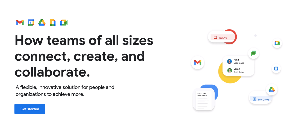
This is the first thing your customers see when they land on your page. So, keep this section clear and concise to address your customers’ pain points right away. Include the main benefit of the product here and express how it can benefit the users.
Subheadline: You can also add a subheading as a supporting statement that elaborates on the heading section and provides additional context.
Visuals: People love interactive visuals. You can also add visual elements to the hero section to hook the customers for longer.
CTA: You may think this is too quick to encourage someone to take an action. But, the truth is a large number of people act instantly if they get what they’re looking for. So, include a clear and visible call-to-action.
2. Product features (and benefits)
Using only text and static images is a bit old-fashioned way. You can use a video or motion graphics to show the product demo or explainer video. A brief video or animation that showcases the product’s key features and their corresponding benefits can inform your target audience about your products and services.
3. Social proofs and Customer testimonials
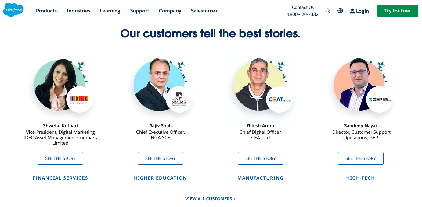
Customer quotes or case studies demonstrate the product’s effectiveness and credibility. Moreover, evidence of the product’s popularity and user base, such as user numbers or logos of companies that use the product helps visitors build trust in your business.
4. FAQ section
Give answers to frequently asked questions that address common concerns or objections your potential customers may have. Try to include all generic questions here. A rich FAQ section leaves a good impression on the customers’ minds. It shows you care for the needs of your customers.
5. Bottom call to action
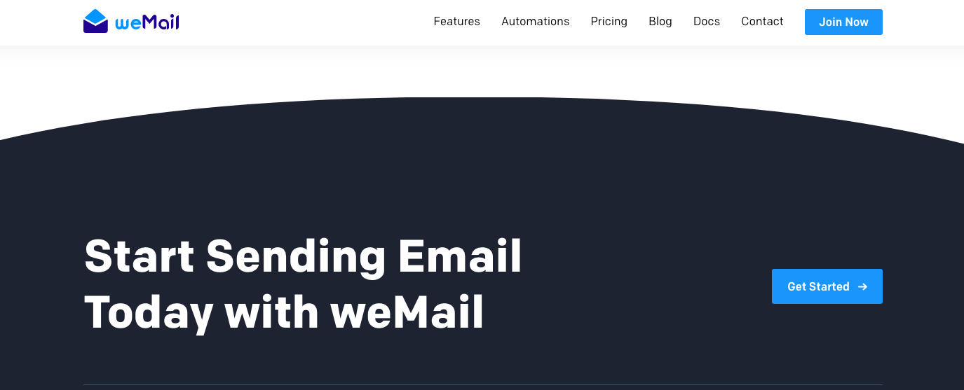
If your visitor comes this far that means he has already seen a lot about your service or product. This is the right place to call him to take an action. The above sections have informed him about your product, here you can drive him to the pricing page.
6. Footer
This is the only place on the landing page where you can clutter the space a bit. Put the links to all important pages of your website here. This section is for people who want further reading. You can input privacy policies, affiliate pages, blogs, about, cookie policies, and other resources here. You can also add social handles like Twitter, Facebook, YouTube, Instagram, TikTok, and more to the footer.
How to create a high-converting SaaS landing page
In this section, we’re going to explain the SaaS landing page best practices. You can create a high-converting SaaS landing page to attract and convert potential customers into paying customers by following these tips.
1. Understand the pain points of your target audience
It’s important to understand your target audience’s pain points when creating a high-converting SaaS landing page. Knowing the potential customers can help you create a compelling message that resonates with them, positions your product as the solution to their problems, and encourages them to take action.
Your potential SaaS customer wants to feel like their needs and challenges are understood by the service provider. That’s why you need to create a landing page that speaks directly to their concerns. This personalized approach can help to build trust and rapport with potential customers, making them more likely to convert and become paying users.
If you don’t take the time to understand your target audience’s pain points, you risk creating a generic message that fails to connect with them. Your landing page might look great, but if it doesn’t address their challenges, they’ll quickly lose interest and move on to your competitors.
Also read: 12 Factors and Tools to Consider While Preparing a ‘High Converting Pricing Page’
2. Clearly state the unique value of your SaaS solution
You need to clearly communicate your unique value proposition to inform the customers why you’re different. Provide them with enough information so they can differentiate your service from others in the market. Show why your solution is the best fit for them. In a crowded market, it’s easy to get lost in the noise. That’s why you need to make sure that your customers understand the benefits of your services and can make an informed decision.
3. Use language that resonates with your target audience
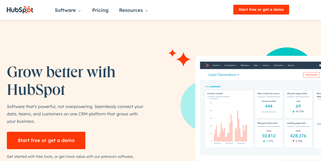
This point aligns with our first point- understanding the persona of your target audience. For example, Appsero mainly deals with WordPress developers who’re looking for a license management tool and selling platform. That’s why we combine technical and generic languages to connect with our target audience. People want to feel like they are being spoken to directly and that the product is designed with their needs in mind.
4. Make use of eye-catching visuals
Visuals are more memorable than text. A picture is worth a thousand words, and a well-placed image can convey the message better than several paragraphs of text. Well-designed visuals break up large chunks of text to make it easier for visitors to consume your message. This helps visitors quickly understand what you offer and why they need it.
In addition, eye-catching visuals can evoke emotions and feelings in potential customers. They can make your product or service seem more attractive and desirable. High-quality images and graphics show that you have invested time and resources into creating a professional and polished website, which can build confidence in your potential customers. Conduct a UX audit to find out what works best for your SaaS solution.
5. Include a strong and engaging call to action
A clear call-to-action (CTA) tells your potential customers exactly what they should do next. They know what they’re doing- whether that’s signing up for a free trial or subscribing to your service. It takes the guesswork out of the decision-making process. Craft a strong CTA to create a sense of urgency, which can be a powerful motivator for people to take action instantly.
6. Showcase customer testimonials and social proof
In today’s digital age of the internet, consumers are tech-savvy and well-informed. They want to be sure whether they are making the right decision or not while selecting a service provider. That’s why it’s crucial to showcase customer testimonials and social proof on your landing page.
By using customer testimonials and social proof, you can demonstrate that your SaaS product is trusted and used by others in the industry. You can encourage potential customers to take action and sign up. Seeing that others have had success with your product can be the extra push they need to make a purchase.
7. Demonstrate your worth with numbers
Numbers provide credibility and proof of your service’s value. When you offer quantifiable results, your customers will believe you more. It gives them a clear picture of what they can expect from you. Besides, numbers help potential customers differentiate your service from competitors. For example, if you can demonstrate that your service delivers faster results than your competitors, you’ll have an advantage.
8. Ensure that the page is responsive on all devices
People are increasingly using mobile devices to access the internet, so a responsive SaaS landing page is not just an option but a necessity. Responsive design allows your potential customers to access and view your page on any device, including desktops, laptops, tablets, and smartphones. It ensures that your page appears and functions correctly on all devices, providing a seamless user experience that can enhance your brand’s credibility and reputation.
A responsive SaaS landing page also has a positive impact on your website’s search engine ranking. Google prioritizes websites that are mobile-friendly and responsive, and this can help you attract more organic traffic and increase your online visibility.
9. Make your service easier to sign up
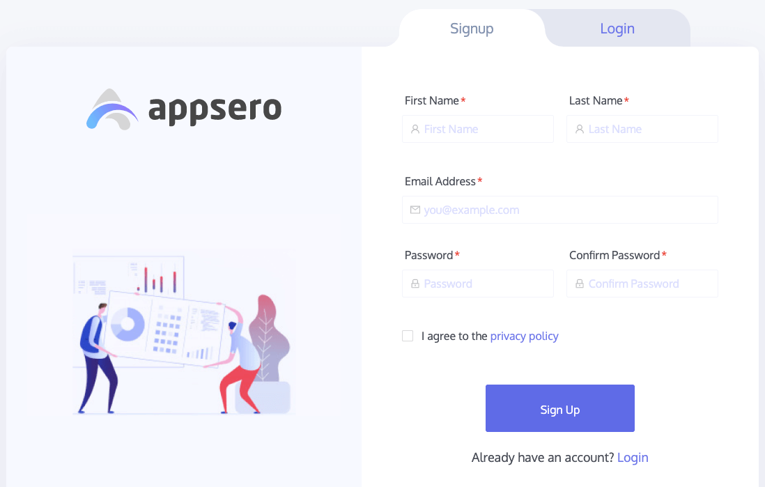
Streamline the sign-up process to reduce customer frustration, increase conversion rates, and ultimately, grow your business. This can be achieved through a variety of methods, such as simplifying the registration form, offering social login options, or providing a clear and more. Making it easier to sign up when creating your SaaS landing page is essential for driving customer acquisition.
Are there any unnecessary barriers that could be removed? Are there any additional features that could be added to improve the user experience? By doing so, you can set your business up for success and create a loyal customer base that will help drive growth for years to come.
10. Test different variations of your landing page
Test different versions of your landing page to see what works best. Try different headlines, visuals, and CTAs to see which combination results in the highest conversion rate. Here are the reasons why you should conduct A/B testing and monitor the results after each implementation:
- Improve conversion rates: By making small tweaks, you can optimize your landing page to increase conversion rates.
- Better user experience: You can ensure that your landing page is easy to navigate, visually appealing, and provides all the necessary information to make a decision.
- Identify areas of improvement: Testing different variations of your landing page can help you identify areas that need improvement.
- Gain insights into your audience: You can learn what messaging and design elements resonate with your audience.
- Stay ahead of the competition: By constantly improving and optimizing your landing page, you can provide a better experience for potential customers and gain a competitive advantage in the market.
As a service provider, it is crucial to ensure that you’re not missing out on any potential customers due to a poorly built landing page. Make the necessary changes to your landing page. Track the performance of different variations and stick to the high-performing design for the long term. You need to revamp your landing page once in a while to drive business growth. Make continuous improvement a habit to succeed as a SaaS company.
Recap: SaaS landing page best practices
Now you know how you can create a landing page for your SaaS product. Let’s sum up the SaaS landing page best practices here.
- Clearly communicate your value proposition: Be concise and use simple language.
- Use attention-grabbing headlines: Make them stand out visually and use language that resonates with your target audience.
- Include social proof: Showcase social proof like testimonials, case studies, and reviews on your landing page.
- Keep your design simple and clean: Use a clean, simple design with plenty of white space to make your content easy to read and understand.
- Use clear, compelling calls to action: Include action-oriented language, and make sure your CTA stands out visually.
- Use high-quality visuals: Make sure they’re visually appealing and convey your messages.
- Make your page responsive: Ensure your page looks and functions well on all types of screens.
- A/B test your page: Test different variations of your design, messaging, and CTA to see what works best.
Your landing page will generate more sales if it’s clear, concise, and compelling, and speaks directly to the needs and interests of your target audience.
Example of a high-converting SaaS landing page
Enough of the theoretical discourse, let’s see a few landing pages that have all these tips incorporated in themselves. You can get inspiration from these real-life examples.
Example 1:
First, have a look at Slack’s landing page. Slack is one of the best tools used to streamline all kinds of organizational communications.
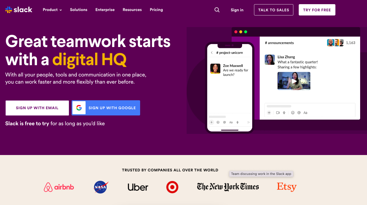
This is the above-the-fold part of this landing page. When a visitor lands on this page, he sees this part without even scrolling. It has all the crucial things such as a well-written and designed hero section, a relevant CTA, and a collection of companies that use Slack.
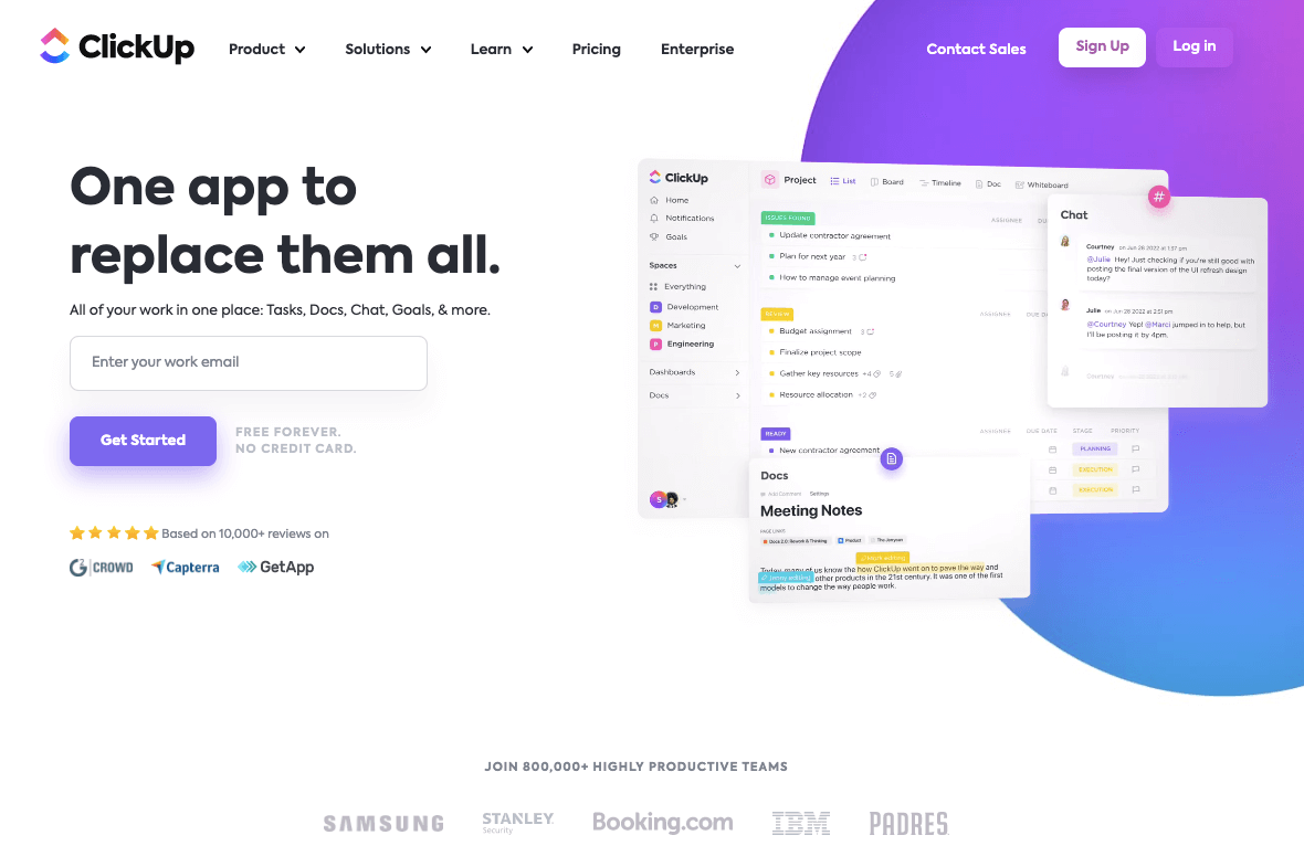
Example 2: Now look at the landing page of ClickUp. This tool is a cloud-based project management tool that is designed to help teams and organizations manage tasks, projects, and workflows. It has experienced significant growth over the past couple of years. The landing page aligns with the best practices of a SaaS landing page.
Example 3:
We try to follow what we preach. Our Appsero landing page also needs improvement. That’s why we recently considered revamping it and giving it a modern touch. Here’s a glimpse of the initial mock-up we’re working on. The final design isn’t ready yet. But this version also follows the SaaS landing best practices.
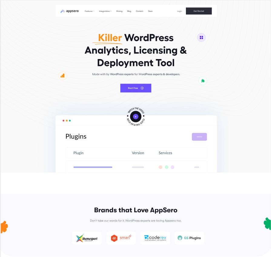
This new page has little or no distractions and clear and concise messages. Since our service includes a good deal of technical things, we kept an explainer video just below the hero text. There is a dedicated section featuring our customers as well.
Concluding note
Long story short, your landing page is the first impression potential customers will have of your product. So, it needs to convey the value of your solution quickly and efficiently. Hopefully, this article explored the key elements that make a great SaaS landing page and provided you with some handy tips. You can implement these best practices to create one that stands out from the competition.
So let’s dive in and start creating a landing page that drives results for your SaaS business!
Subscribe To Our Newsletter
Don’t miss any updates of our new templates and extensions
and all the astonishing offers we bring for you.
