12 Factors and Tools to Consider While Preparing a ‘High Converting Pricing Page’
It’s essential to have the right landing page pricing if you want to boost your sales and improve conversion rates. The way that you price your products plays an important role in influencing your customers’ purchase decisions, and even the slightest discrepancy can make or break a sale.
Here are some factors to consider while preparing a high-converting pricing page along with some tools to help you create one.
Factors for High Converting Pricing Page

1. Limit friction points
Friction points or FUDs (fear, uncertainties, and doubts) are areas on a pricing page where buyers get stuck and don’t convert. And as stated in the article by Agility PR Solutions, limiting the friction points on your pricing page can increase the chances of buyers converting.
To reduce FUDs, start by identifying which ones are causing the most problems. Then, add essential webpage elements like frequently asked questions (FAQs), live chat, and testimonials. You may also offer a free trial or money-back guarantee or include other necessary plugins to come up with high-converting landing pages.
2. Price anchoring
Price anchoring is a psychological phenomenon in which people are more likely to purchase an item or service if the price is first presented to them in a particular way.
For example, if someone is browsing through a department store and they see the shoes labeled at $99, they’re more likely to buy those shoes than if they saw the same shoes priced at $79. This principle can be used in marketing to influence people’s decisions about what to buy.
One instance of how this principle can be used in marketing is by displaying more expensive plans first on a pricing page. If you have two different pricing plans available—one that costs $9 per month and another that costs $12 per month—people are more likely to buy the plan that costs more.
Why? Because it seems like a better deal. This technique has been proven in a study by the University of Arizona.
3. Highlight recommended plan/product
It’s necessary to highlight your most recommended plan or product on your pricing page for a few reasons. First, it’ll help visitors understand what your company offers and how it can benefit them. Second, you’ll increase the chances that visitors will convert into paying customers.
Finally, by making your most recommended plan or product prominent on your pricing page, you’ll send a strong signal to potential customers that this is the best option for them.
When highlighting your most popular plan or product, take note that it doesn’t necessarily have to be the most expensive one, but the one where customers can gain the most value. This strategy is based on evidence and analytics by the University of Northern Colorado.
4. Use number 9
There are a few reasons why the number 9 (i.e. $39 instead of $34) can be effective on pricing pages. First, it’s seen as a lucky number in many cultures. This can make people feel more positive about your product or service and encourage them to purchase it.
Second, it’s often associated with premium products and services. This can give your pricing page a more luxurious feel and make people more likely to spend money on your product or service.
Finally, the number 9 can help create a sense of urgency. When people see that your price is ending in 9, they may feel like they need to act quickly before the price goes up. This can encourage them to make a purchase sooner rather than later.
5. Prominent CTA
A pricing page is only as good as its call-to-action (CTA). To achieve the best pricing pages, it’s essential to have a prominent CTA.
The CTA should be clear and concise, and it should stand out from the rest of the page. It should also be easy for the user to see and understand what they need to do.
Having a strong CTA on your pricing page can be the difference between a successful conversion and a missed opportunity. So, make sure your call-to-action is up to par to give your users the best chance at converting.
6. Integrate buyer personas

If you aren’t using buyer personas to guide your eCommerce pricing strategy, you’re missing out on a huge opportunity to increase conversions.
When you take the time to create detailed buyer personas, you’ll have a much better understanding of what your target customers are looking for. This, in turn, will help you create better packages/offers and a pricing page that’s more likely to convert them into paying customers.
Here are a few tips for using buyer personas to create a high-converting pricing page:
- Start by creating detailed buyer personas for your target customers. Take into account their age, gender, location, educational background, occupation, interests, and pain points.
- Use this information to determine what type of pricing structure would appeal to each persona.
7. Simple is better
It’s no secret that a well-designed pricing page is essential for any business looking to convert leads into paying customers. But what many businesses don’t realize is that a simple page design or theme, with clear and concise copy, is often the best way to achieve this.
In today’s age of overwhelming choices and options, simplicity is key when designing or updating a pricing page theme that will actually get users to take action. Too much choice can be paralyzing, so it’s important to make the decision-making process as easy as possible for potential customers.
The same goes for copy—it should be direct and to the point, without any fluff or filler. The goal is to clearly communicate the value of your product or service, and what users can expect from each pricing plan.
8. Use helpful software integrations
As eCommerce businesses strive to achieve high conversion rates, many are turning to helpful integrations like shopping cart software solutions to give their pricing pages a boost. By integrating with shopping cart tools, businesses can take advantage of powerful features like automated tax calculations, real-time shipping quotes, and abandoned cart recovery.
With so many options on the market, it can be difficult to choose the top shopping cart software solutions for your business. But by taking the time to find a solution that fits your needs, you can create a pricing page that converts at a high rate.
Helpful Tools for Analyzing User Behaviour to Build a Data-driven High Converting Pricing Page
9. Appsero

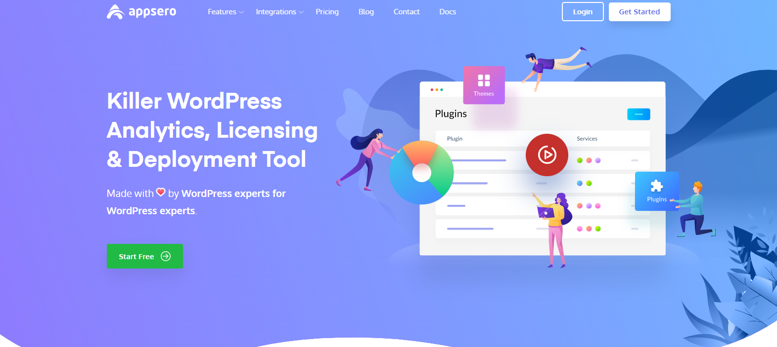
Appsero is a SaaS tool for WordPress plugin developers. It takes care of software licensing, updates deployment, and analysis.
The main feature of Appsero is managing software licensing, one of the biggest pains for any WordPress plugin developer. You can also deploy updates to multiple platforms from Appsero saving you a lot of time. Another cool functionality of Appsero is to help you analyze users with not as much effort. You can collect user analytics through the app for information on the number of active installs, downloads, competitor analysis, installation growth, and deactivation factors.
With Appsero’s detailed analytics, you can get an understanding of user behavior and design a high-converting pricing page with more informed decisions.
10. Crazy Egg
Crazy Egg is a heatmap tracking service that provides valuable insights into how users interact with websites. By visualizing mouse clicks, scroll behavior, and other interactions, website owners can make better decisions about how to improve their user experience. Crazy Egg also offers reports that show where users are coming from and what devices they’re using.
11. Unbounce
Unbounce is a powerful tool that allows you to build and test landing pages without the need for coding or design skills. With the software, you can create custom landing pages optimized for conversion and mobile-friendliness. You can also A/B test your pages to see which version performs better.
12. Landing Page Analyzer
Landing Page Analyzer is a simple yet effective tool that can help you review and evaluate your landing page. It provides an easy-to-use interface that allows you to see how well your page is performing.
The tool also allows you to see how many people are visiting your page and how long they stay on it. This information can be valuable in understanding the effectiveness of your landing page.
Create a Pricing Page That Converts
There are several factors and tools to consider while preparing a high-converting pricing page. By keeping these key points in mind, you can create a high-converting pricing page that will help increase your conversion rate and boost your business. You’ll need a combination of key strategies and the right landing page tools to do so successfully. With that, follow the steps we provided here to create a high-converting pricing page.
Subscribe To Our Newsletter
Don’t miss any updates of our new templates and extensions
and all the astonishing offers we bring for you.
